OKC Has Been Plagued By Bad Alternates
By Jared Colbert
The Oklahoma City Thunder have a history of utterly bad alternate jerseys. In their small history they have unveiled four alternates, and they’ve all sucked. Now, as for their regular home and away, I love them. The color schemes are fantastic, they keep them clean, and overall they just look good. However, they can’t get an alternate to look that way for the life of them. Here we go.
Dark Blue, Vertical ‘Thunder’

These could be the ones I hate the most from Adidas era. The dark blue by itself doesn’t go the great color scheme OKC has justice. And whoever thought that vertical team names worked should have been kicked out of that meeting like in that meme from years ago.

It just looks bad on the court and it doesn’t feel like it fit with their home and aways. And yet they kept all the way until the Nike deal.
Sleeved Whites

Sleeves do not belong in the NBA, and yet time and time again someone tries to bring them back. The wore them for Christmas one year, and made everyone look terrible. Even the Celtics made jerseys with sleeves for their “Parquet Pride” alternates and made those look awful. It’s never worked, and it never will.
Orange with ‘OKC’
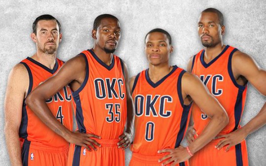
Orange is hard to make work as the main color on an NBA jersey. There’s a reason that the two teams whose main or secondary color is orange, don’t use it for their roads: the Suns use purple, and the Knicks use blue. Those two teams also have orange as an alternate, and it still doesn’t work. Too loud, too glaring. Also I’m not at all of fan of just the OKC, or shortening anyone’s city name in general. I’ll give credit that the Thunder are commonly referred to as OKC, and it’s not something stupid like BKLYN.
Statement Jersey
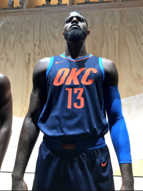
A Nike executive threw up on the Thunder Statement jersey design, but it was due so he had to turn it in anyway, and someone approved it. That’s what this jersey is. They took the worst elements of each of the previous three designs and meshed it into one. The orange letters directly clash with the dark blue background. The light blue borders look like they don’t fit in. The OKC, again not a fan, also has this weird hash mark halfway through all the letters. Oh, and on the back they have these faint, horizontal, light blue lines going almost all the way down. Absolutely gross. Yes the Thunder have been plagued by bad alternates, but they really outdid themselves this time.
Twitter: @C109Sports

Comments
Post a Comment